.png)

eFlair webtech
Build Scalable, Consistent, and Efficient Products with Our Design Systems
We create powerful design systems that bring clarity, speed, and consistency to your digital products. From defining visual tokens to building component libraries, our design systems help teams scale faster, reduce design debt, and maintain a seamless brand experience across platforms.
Let’s Connect
eFlair webtech


Why Design Systems Matter
Your product is more than just screens—it’s an ecosystem. Without a design system, teams face inconsistencies, slower delivery, and wasted effort. A strong design system ensures that every element—colors, typography, spacing, interactions, and components—follows a single source of truth.
Our design system services are tailored to unify your brand, accelerate development, and future-proof your product. Whether you’re scaling a startup or optimizing enterprise workflows, we make sure design and code work in perfect harmony.
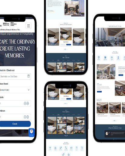
Component Library & UI Kit
We build a complete Figma component library with variants, states, and responsive rules. Your team designs faster, with no inconsistencies or guesswork.
Design Tokens & Theming
From colors to typography, spacing to shadows—we set up design tokens that sync directly with codebases, ensuring brand consistency across platforms, themes, and modes.
Documentation & Governance
We provide clear documentation, best practices, and governance workflows that keep your system relevant and easy to adopt. This ensures scalability without chaos.
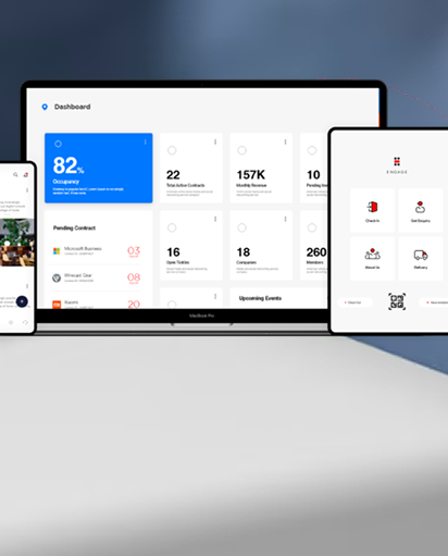
Dev Parity & Code Libraries
We extend design systems into framework-ready code libraries with Storybook integration, ensuring design-to-dev parity and reducing handoff friction.
Our Process
We build scalable, consistent design systems that align design and engineering. From auditing UI to shipping tokens, components, and docs, every step improves speed, quality, and adoption.
Research
We inventory your current UI, map duplication, and define a foundation for tokens, patterns, and accessibility. Competitive benchmarks guide naming, structure, and governance.
Audit & Gap Analysis
We catalog components, states, and variants; flag inconsistencies, a11y issues, and design debt.
Best‑Practice Benchmarking
We compare against Material, Polaris, and Lightning to shape standards and structure.
Support
We equip teams with clear documentation, contribution rules, and onboarding to ensure fast, organization‑wide adoption.
Developer‑Friendly Documentation
Usage guidelines, do/don’ts, tokens, and specs with links to Storybook and code.
System Training & Governance
Playbooks, review workflows, and versioning to keep the system healthy as it grows.
Build
We deliver a modular Figma library with variants and constraints, plus code‑ready components that mirror design.
Component Library & Tokens
Responsive components, states, and design tokens (color, type, spacing, elevation, motion).
Code Parity & Storybook
Framework components (React/Vue/Angular) with CI/CD versioning and live docs in Storybook.
Frequently
Asked
Questions